Your model says a feature matters. That doesn't mean changing it does anything.
The stakeholder question that breaks every SHAP plot
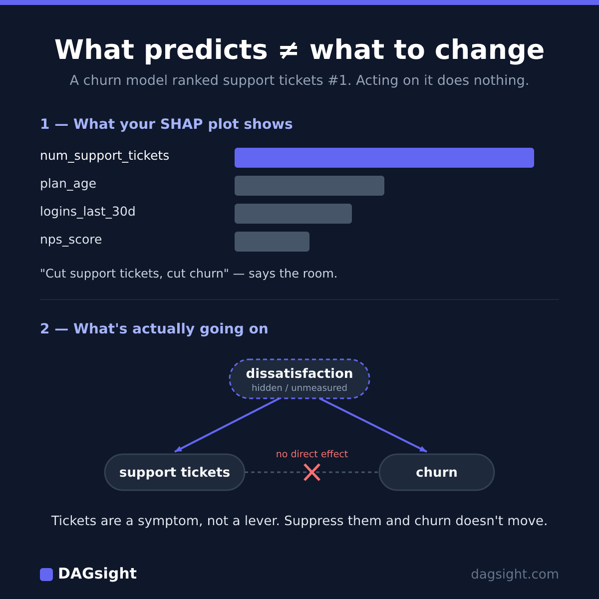
You trained a gradient-boosted churn classifier. It scores well, and the team trusts it. You open the SHAP summary plot, and the top feature by a wide margin is num_support_tickets over the last 30 days: the more tickets a customer files, the higher the model's churn probability.
So someone asks the obvious next question. "Great — so if we cut support tickets, do we cut churn?"
The honest answer is that you have no idea. The SHAP plot doesn't contain that information, and it never claimed to.
There's a variable your data doesn't measure. Call it dissatisfaction. Unhappy customers file more tickets, and unhappy customers churn. The tickets don't cause the churn; both are downstream of the same hidden unhappiness. The model leans hard on num_support_tickets because it's a high-resolution measurement of the thing it can't see directly. The proxy is standing in for the missing variable.
Act on it anyway — hide the support button, deflect everyone to a chatbot, drive num_support_tickets to zero — and all you've done is take away the customer's ability to file a ticket. Their dissatisfaction is untouched. They're still unhappy, and they still churn. You silenced the symptom and left the disease alone.
That trap is easy to walk into precisely because it doesn't look like a rookie correlation-isn't-causation mistake. It arrives wearing a well-validated model and a SHAP plot.
Does SHAP show causation?
No — SHAP does not show causation. SHAP explains how a model uses an input to make predictions, not what happens in the real world if you change that input. A feature can dominate your SHAP plot while being a symptom of the target, a proxy for a hidden cause, or downstream of the thing you'd actually need to change.
None of this is a knock on SHAP. SHAP is doing its job, and doing it correctly. That job is attribution: given the model you already fit, how much does each feature move its predictions? It's a real question with a useful answer, and SHAP answers it faithfully. The error is a human one — reading the answer to one question as if it answered another. "What does my model rely on?" and "What should I change in the world?" are different questions, and no SHAP value connects them.
What feature importance actually measures
SHAP, permutation importance, and split gain are computed in different ways, but they aim at one target: which inputs the model leans on to produce its predictions.
- Gain measures how much each feature reduced loss across the splits that used it.
- Permutation importance measures how much accuracy drops when you scramble a feature.
- SHAP distributes a prediction across features in a way that's locally consistent and additive.
All three vary the input within the model's learned view of the data and watch the output move. That is exactly what you want for debugging a model, sanity-checking it, or ranking predictors. None of it says anything about what happens if you reach into the world and change the feature itself.
The distance between those two operations — varying an input inside a fitted model, versus intervening on it in reality — is what this article is about.
Predictive importance vs causal effect
Predictive importance and causal effect are built from different objects and answer different questions. They only line up under conditions real data rarely meets.
| Feature importance (SHAP, gain, permutation) | Causal effect | |
|---|---|---|
| Question answered | What does the model rely on to predict? | What happens to the target if I change this? |
| Built from | A predictive model fit to observed data | A causal model + assumptions about structure |
| Reverse causation | Invisible — symptom and cause look identical | Explicitly modeled |
| Use it to | Debug/explain a model, rank predictors | Decide what to intervene on |
The row that bites is reverse causation. To a predictive model, a feature that causes the target and a feature that's caused by the target look identical: both carry information, both lower the loss, both can land at the top of the SHAP plot. The model has no notion of which way the arrow points, because direction was never part of what you asked it to learn. A causal effect is defined by that direction. Flip the arrow and the answer flips with it.
Three ways an important feature isn't a lever
An input can top your importance chart for at least three reasons that have nothing to do with it being something you can pull.
- It's a proxy for a hidden common cause. It carries no causal signal of its own and is tied to the target only through a shared driver you didn't measure. It predicts well because it measures that driver. Example:
num_support_tickets, standing in for unmeasured dissatisfaction. - It's downstream of the target. Leakage, or plain reverse causation: the feature is caused by (or recorded after) the outcome, so it predicts superbly because the outcome already happened. Acting on it is meaningless. Example: a
cancellation_survey_sentflag predicting churn — it only exists because the churn did. - It's confounded with the real cause. It rides along with the actual driver and absorbs some of the credit, so its importance reflects the driver's signal more than its own. Example:
discount_usedgetting credit that belongs topurchase_intent— the two move together, and the model can't separate them.
The first one rewards a hard look, because it fools careful people. The more directly a feature measures the symptom, the higher its importance and the more useless it is as a lever. High importance there isn't a sign you've found something to act on. It's a sign you've found a very good thermometer.
Can you use SHAP for causal inference?
Only under assumptions you usually can't check, and even then not directly.
For SHAP values on a predictive model to read as causal effects, you'd need something close to: no unmeasured confounding (every common cause of a feature and the target is in your columns), the model conditioning on exactly the right adjustment set, and no leakage or reverse arrows. Those are strong conditions, and the uncomfortable part is that your data can't tell you whether they hold. A confounder you never recorded is, by definition, not in the dataset to raise its hand.
Even when the conditions do hold, there's a deeper problem. SHAP is an attribution method for a predictive model, not a causal estimator. A causal estimate comes from a causal model: a stated structure plus an identification strategy — adjustment, instruments, or an experiment. A boosted tree with a SHAP plot on top is none of those, however clean the data. So the honest answer to "can I use SHAP for causal inference?" is: not as a shortcut around building a causal model. And once you've built and defended that model, you didn't need the SHAP plot to get the effect.
From prediction to a causal graph
So what does help? Not a better importance method, but a different question answered with a different tool. If your job is to predict churn, keep the boosted model and the SHAP plot. They're correct for that, and nothing here replaces them or claims to be "more accurate." It's a different question entirely.
What DAGsight adds is structure. Causal discovery proposes a causal graph over your variables: which predictors are plausible causes, which look like proxies or downstream symptoms, and where the data simply can't pick a direction. A flat ranking of "what the model uses" turns into a shape you can reason about — this feeds that, these two share a parent, this one is probably an effect rather than a cause.
Now the honest part, because this is exactly where it would be tempting to oversell. Our churn example has a latent confounder: dissatisfaction was never in the columns. That violates the causal-sufficiency assumption our default method makes. So discovery does not quietly recover the hidden driver, name "dissatisfaction" for you, or hand back a clean tickets → churn arrow. If the real driver isn't in your data, discovery can be misled too. There is no free lunch.
What it does honestly buy you:
- It won't confidently report
tickets → churnas a directed lever. Where the structure is ambiguous, it leaves the edge undirected rather than inventing an arrow — the Markov-equivalence ceiling, where some edges can't be oriented from observational data at all. - If you do include candidate drivers of dissatisfaction (onboarding friction, response times, recent outages), it can surface the common-cause pattern around tickets and flag it as a likely symptom rather than a lever.
- The edge "confidence" it reports is bootstrap stability: how often an edge survives across resampled fits within a run. It is not a probability that the edge is real, and it is not a p-value. Read it as a measure of how fragile an edge is, not a verdict on whether it's true.
The line to keep in mind: causal discovery doesn't hand you the answer. It tells you which lever-hypotheses are worth an experiment. And the size of any effect is a separate estimation step — discovery proposes the structure; it doesn't measure magnitudes.
On accuracy, plainly: on standard benchmarks our engine recovers edges at roughly the same level as the established open-source library running the same algorithms — at par with causal-learn, not above. If you're fluent in a Python stats stack, you can do this yourself. DAGsight is the hosted, no-code version, and how it compares to writing it yourself is laid out separately.
A 60-second sanity check before you trust an importance plot
Before a top SHAP feature becomes a roadmap item, run it through these. Any yes means the importance score is silent on causality and the feature may not be a lever:
- Could this feature be a symptom of the target rather than a cause? Would it move because the outcome happened?
- Is there a plausible unmeasured driver of both this feature and the target? If so, you may be measuring the hidden cause, not acting on it.
- Was this feature recorded at or after the moment the target was decided? Leakage and reverse causation hide here.
- To change this feature in the world, would you first have to change something upstream of it? If yes, that upstream thing is your candidate lever, not this one.
None of these prove anything. They tell you where to stop trusting the ranking and start drawing the graph.
Try it
Upload a CSV and get a causal graph back in about a minute: directed edges where the data supports a direction, undirected edges where it can't decide, and a bootstrap-stability score on each so you can see which edges are fragile. It won't replace your SHAP plot, and it won't pretend to name your hidden confounder. What it will do is tell you which of your top features deserve an experiment instead of a line on the roadmap. Free tier, no card: start free.