Your dashboard shows correlations. Here's how to find what actually moves the metric.
The webinar that wasn't closing deals
A sales team noticed that leads who attended a product webinar closed at roughly twice the rate of leads who didn't. Tight correlation. Big sample. So they poured budget into webinars and pushed every open lead to attend.
Close rate didn't move.
What had actually happened: leads who were already serious — already leaning toward buying — were the ones who bothered to show up to a webinar and the ones who closed. Attendance was a symptom of intent, not a cause of it. The lukewarm leads who got dragged in sat through 40 minutes and bought at exactly the rate they would have anyway.
This happens every quarter, in product, marketing, and revenue teams. Two metrics move together, a deck gets built, a decision gets made, the decision doesn't work, and the post-mortem is uncomfortable. Dashboards are correlation machines. They're excellent at that. It is not the same job as telling you what causes what.
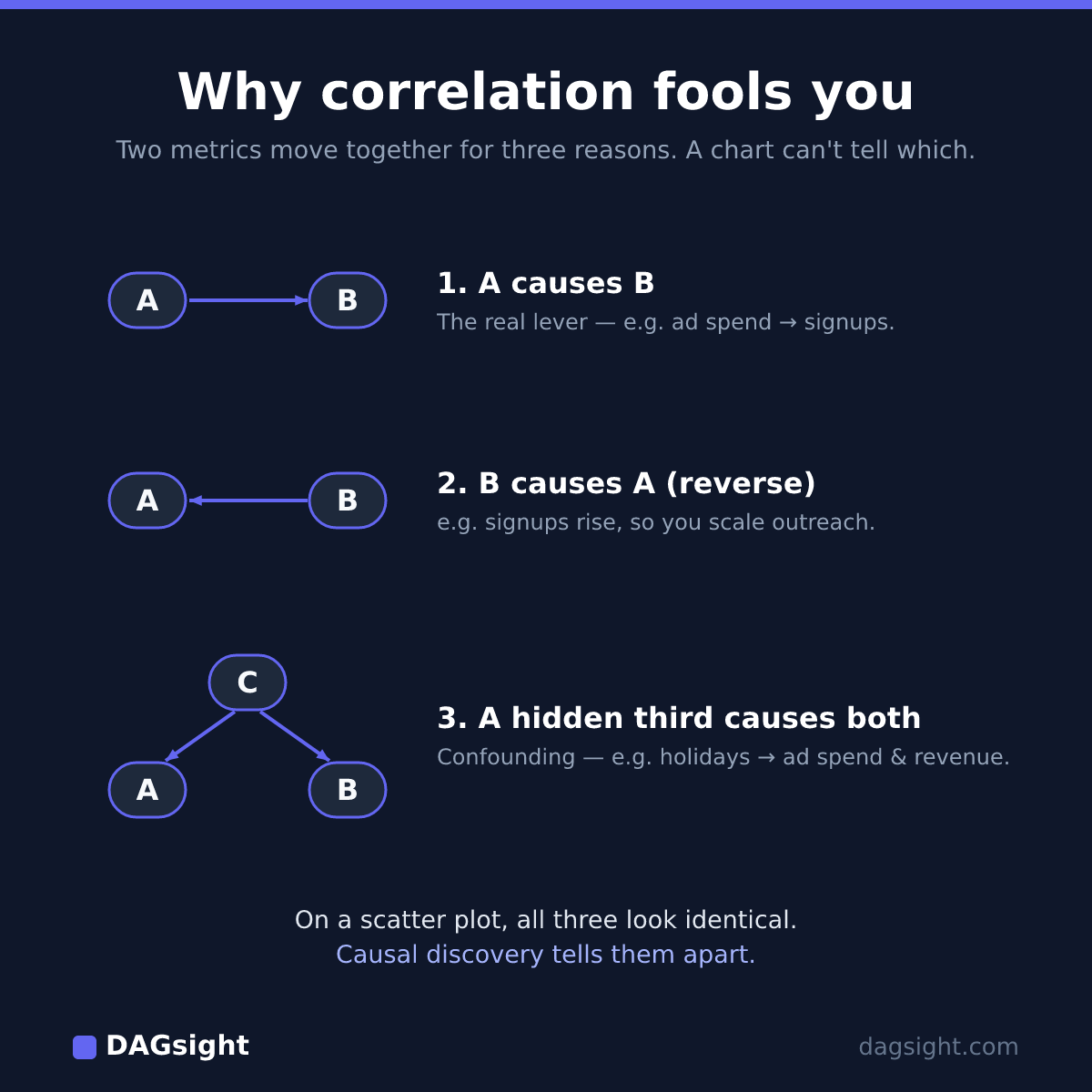
Why correlation fools smart people
Two variables correlate for exactly three structural reasons, and a correlation coefficient can't tell you which one you're looking at:
- A causes B. Email sends cause signups. Here the correlation is actionable — send more, get more.
- B causes A (reverse causation). Your team scales outreach because signups are up. Cutting emails wouldn't lower signups; it would just slow your own pipeline.
- A third thing causes both (confounding). The holiday season drives up both ad spend and revenue — they move together, but neither drives the other. Double ad spend in January expecting the same lift, and you'll be disappointed. (The confounder isn't always obvious like seasonality; the unrecorded ones are the dangerous case — more below.)
From a scatter plot, all three look identical. That's the whole problem.
What causal discovery actually does
Causal discovery is a family of methods from statistics and computer science. Instead of looking at correlations one pair at a time, it looks at the pattern of conditional (in)dependencies across all your variables at once, and uses that pattern to propose a graph: which variables plausibly cause which.
The trick is that different structures leave different fingerprints. If X and Y are correlated but become independent once you control for Z, that says something specific about whether Z is a common cause or a step in between. Test enough of those relationships across the whole dataset and you can rule out a huge number of causal structures and keep a much smaller set of plausible ones.
The output is a graph with both directed and undirected edges — arrows where the data supports a direction, plain lines where it can't pick one. It is not proven truth. It's a set of defensible hypotheses with explicit uncertainty — which is strictly more than a correlation table gives you, and it's the honest description of the method.
A worked example: a marketing funnel
Here's the part most write-ups get wrong, so let's be precise.
We built a synthetic dataset — generated from a causal model we specified, so we know the right answer before running anything. Start with a clean linear funnel:
ad_spend → signups → activation → revenue
Generate a few thousand rows with realistic noise, hand the raw CSV to a causal-discovery algorithm with no hints, and here's what comes back:
- The skeleton is perfect. It finds exactly those three connections —
ad_spend–signups,signups–activation,activation–revenue— and no spurious ones. - Every edge comes back undirected. Not one arrow. Just lines.
(On data this clean and synthetic, a correct skeleton is expected — that's not the point. The point is to show what the algorithm reports about direction.)
That surprises people, but it's correct, and it's the most important thing to understand about this whole field. A pure chain A → B → C and its exact reverse C → B → A produce identical correlation patterns. So do all the in-between orderings that don't introduce a collision. Observational data — no matter how much of it, no matter how good the algorithm — literally cannot tell a chain's direction apart. This is a proven result (Verma & Pearl, 1990), called Markov equivalence. An honest tool reports those edges as undirected instead of flipping a coin and drawing an arrow.
So how does any edge ever get a direction? You need a specific structure in the data: a collider — a variable with two causes that are independent of each other.
Add one more independent driver to the funnel — say organic_traffic, which also feeds signups and whose volume is set independently of ad_spend. Now the structure is ad_spend → signups ← organic_traffic, then signups → activation → revenue as before.
Now signups has two independent parents. That leaves a fingerprint the algorithm can detect: ad_spend and organic_traffic are unrelated on their own, but become related once you condition on signups. Only one orientation produces that pattern — both arrows pointing into signups. From there the rest of the chain is forced: pointing activation → signups would have to create a second collider the data doesn't show, so the only consistent orientation is outward — signups → activation → revenue. (This propagation step is standard; the rules are Meek's, 1995.)
One independent fork unlocked direction for the whole funnel. No fork, no direction. That's the entire game: you can recover a cause's direction exactly where your data contains the right structure, and not where it doesn't.
Real datasets are a mix. On the SACHS protein-signalling benchmark — a standard test with a known answer — our engine recovers a good share of the correct connections (skeleton F1 around 0.64) and orients roughly half of those, leaving the rest undirected because the data doesn't contain the collider fingerprints needed to force a direction. That's not the tool being weak; that's the data being honest about what it can and can't support.
And it isn't magic. With smaller samples and more variables, the algorithm can also miss a real edge or invent a spurious one — conditional-independence tests get noisier as data thins. Treat results on small samples as low-confidence starting points, not conclusions.
The limits worth knowing before you trust any of this
Three things to know before trusting any causal-discovery output — ours or anyone's:
Observational data has a hard ceiling. Some graph structures are provably indistinguishable without an experiment (that's the Markov equivalence above). No tool beats this, because no tool can. Anyone claiming to "find the true causal graph" from observational data alone is overselling.
Unmeasured confounders are invisible. If something you didn't record drives two things you did, the algorithm can't know it's missing — it'll draw an edge between your two variables instead of pointing at the hidden cause. Knowing which variables to include matters enormously. Garbage in, confident-looking graph out.
Sample size is real. Causal discovery on 300 rows and 20 variables is a bad idea. As a rough heuristic, aim for at least 10–20× as many rows as variables — more if the data is noisy.
None of this makes the method useless — it makes it honest. A correlation table has every one of these limits too and doesn't tell you about them. Causal discovery at least surfaces where the uncertainty lives.
How to actually use it
Use it as a hypothesis-narrowing tool, not an answer machine.
You want to move revenue. The graph says activation sits right before it; ad_spend and organic_traffic feed signups, which feeds activation. Where the graph leaves an edge undirected, that's your flag: run an experiment there before committing budget. Where it's confidently directed, you have a ranked shortlist of where leverage plausibly lives.
You've gone from "anything could be moving revenue" to "here are the four most defensible places to look, and here's the one we need to A/B test properly." That's a real compression of uncertainty — and you got it before pouring a quarter's budget into the next webinar push that turns out to be a symptom, not a cause.
On accuracy, to be plain: on standard academic benchmarks our engine recovers the right set of edges at roughly the same level as the established open-source library (causal-learn) running the same algorithms — at par, not above. Edge direction is lower and capped by Markov equivalence for every one of them. We publish that because the honesty is the point.
So why not just use causal-learn yourself? If you're comfortable in a Python environment, do — it's genuinely good. DAGsight is the hosted, no-code version for people who'd rather upload a CSV than pip-install a stats stack, choose an algorithm, clean the data by hand, and squint at a matplotlib plot: it picks the method for your data's shape, scores how stable each edge is across resamples, and draws the graph — directed and undirected edges and all. Same class of engine, none of the setup.
Related: if you build predictive models, see why feature importance isn't causation — the same trap, wearing a SHAP plot.
Try it
DAGsight does exactly this from a CSV in about a minute — upload your data, get a causal graph back with confidence scores and honest undirected edges where the data can't decide. Free tier, no card required: start here.